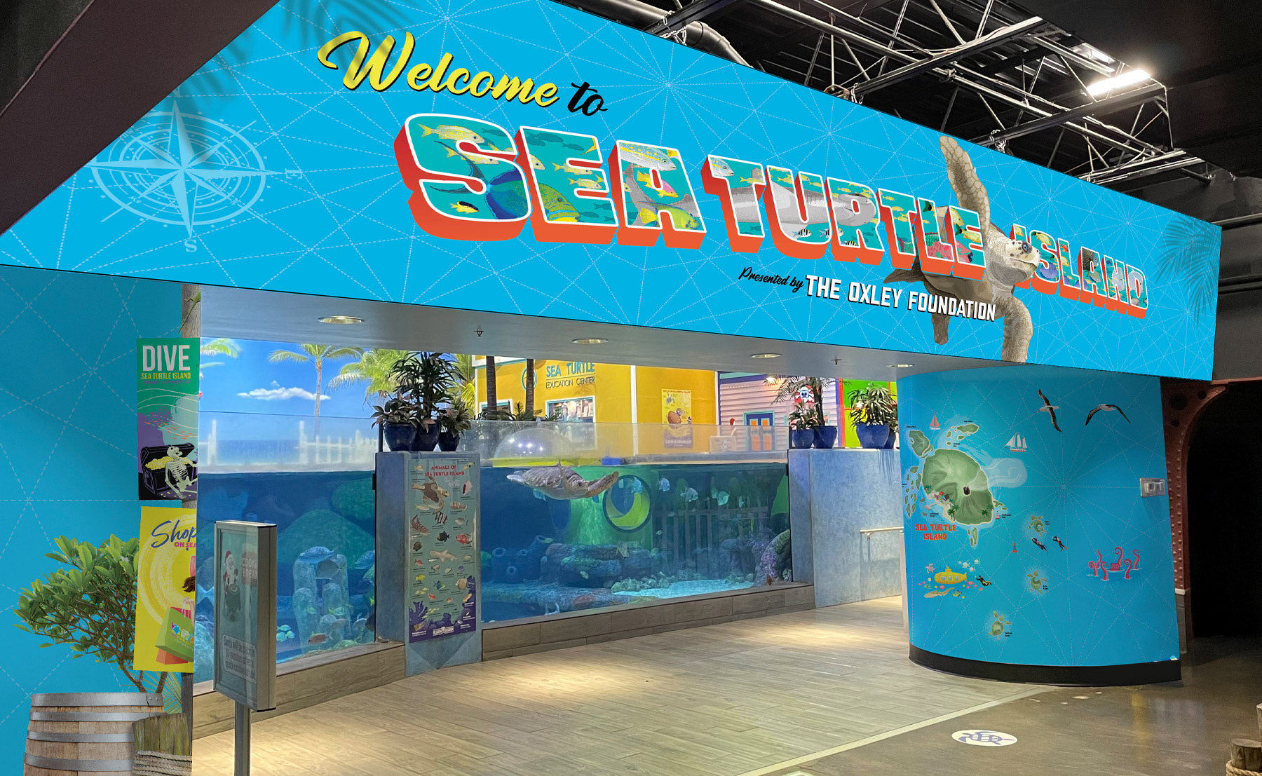
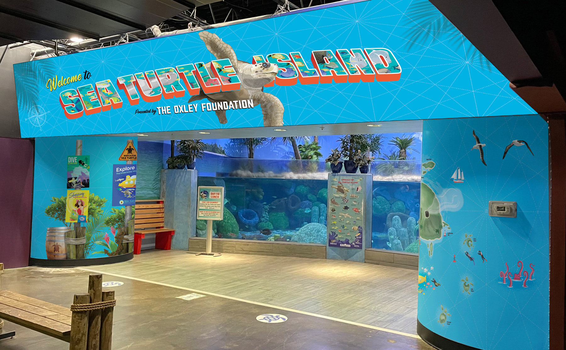
I designed the entrance to Sea Turtle Island to evoke the feel of a tropical tourist destination. The cool blue tones are overlaid with a nautical map pattern, while the 'Sea Turtle Island' lettering draws inspiration from vintage travel postcards.
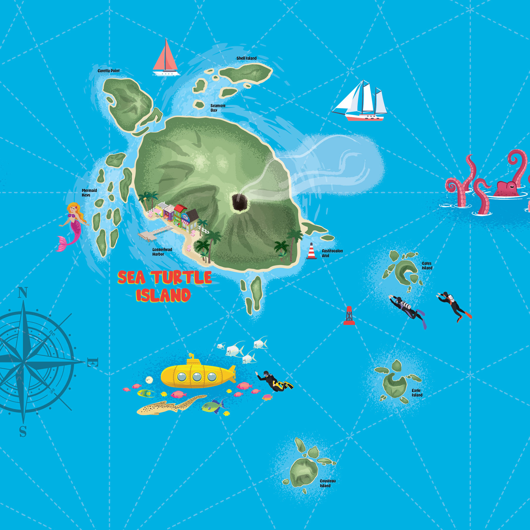
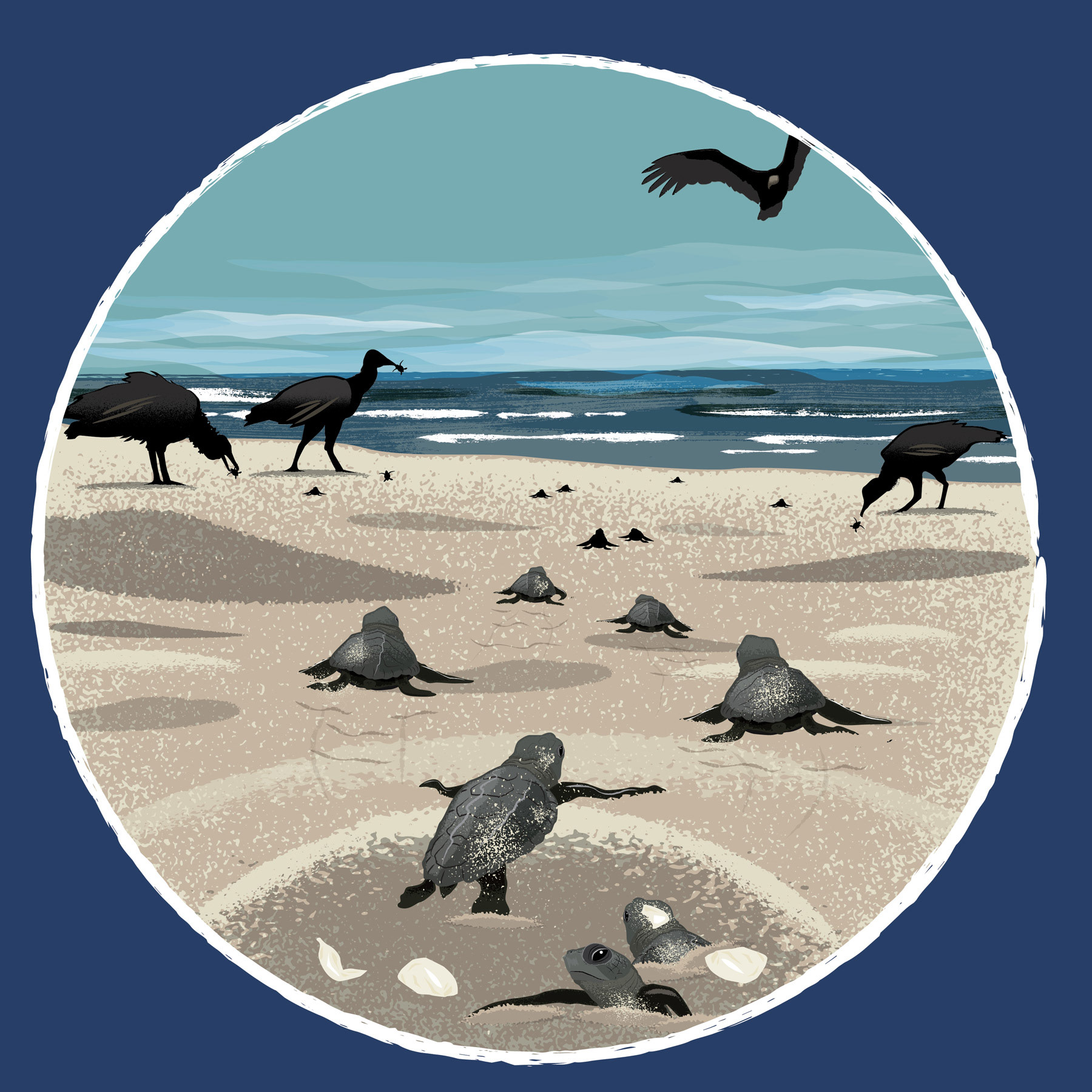
I designed the Sea Turtle Island map to visually explain the exhibit’s name—shaped like a sea turtle and filled with playful details that echo the guest experience. The yellow submarine represents the real sub kids can climb into for an “undersea view.” I named the various islands after iconic oceanographers like Sylvia Earle and Jacques Cousteau, along with a nod to Tolkien’s Fastitocalon, a mythical sea turtle from one of his medieval-style poems. Mermaid performers and other tropical touches reinforce the imaginative Caribbean vibe.
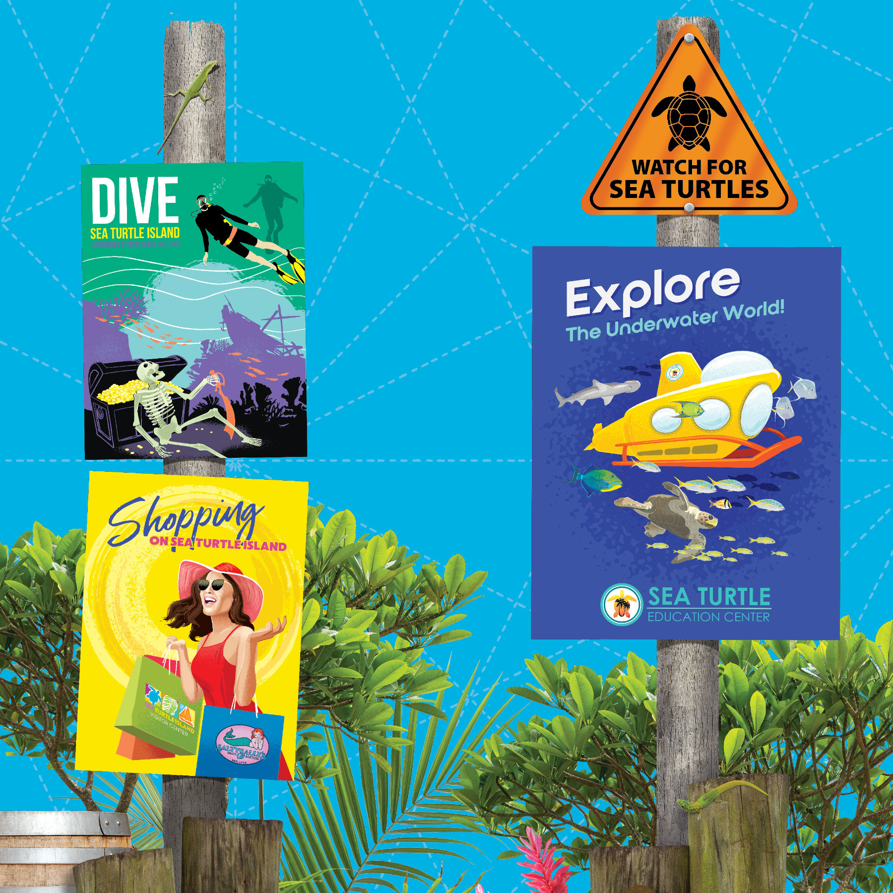
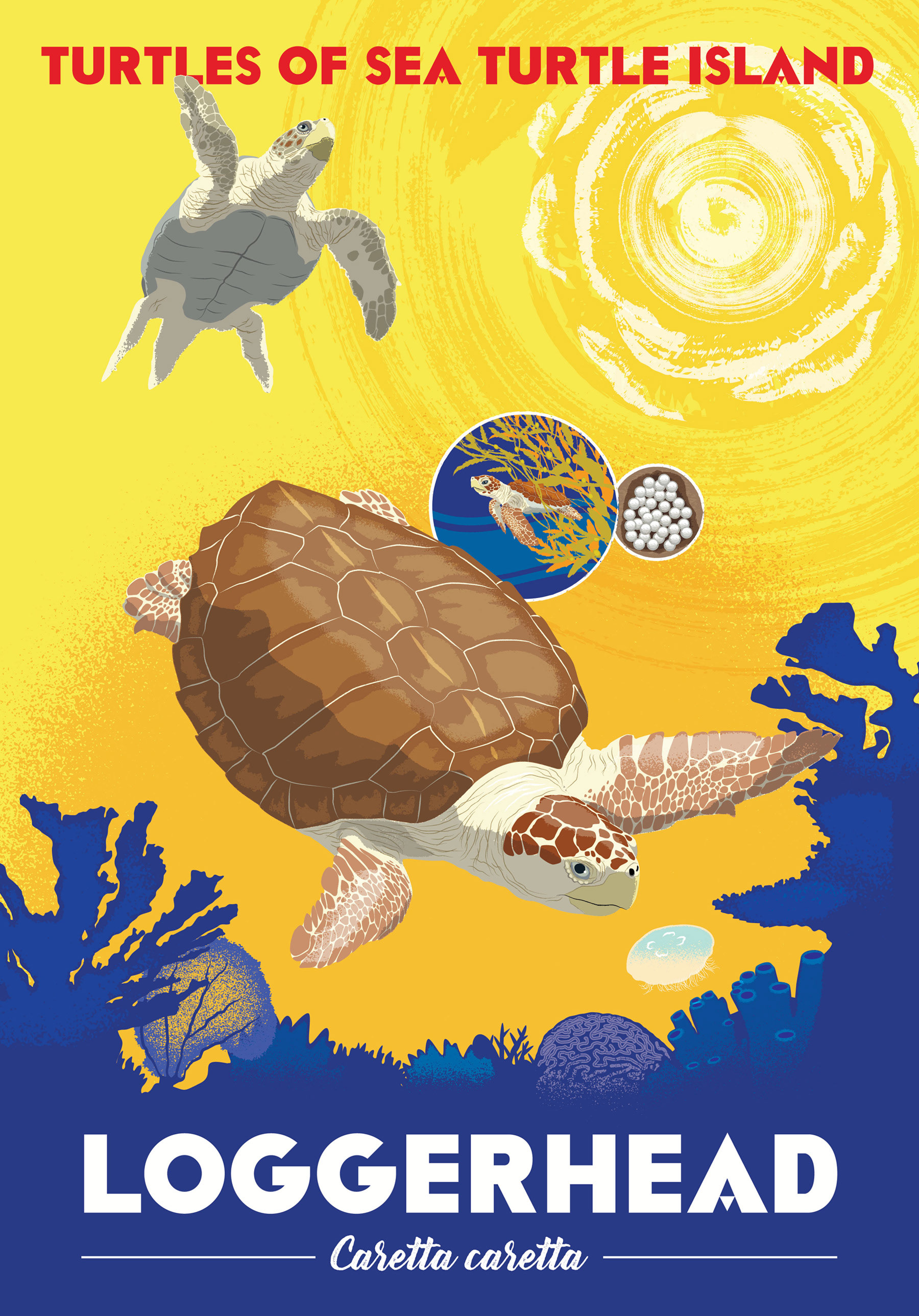
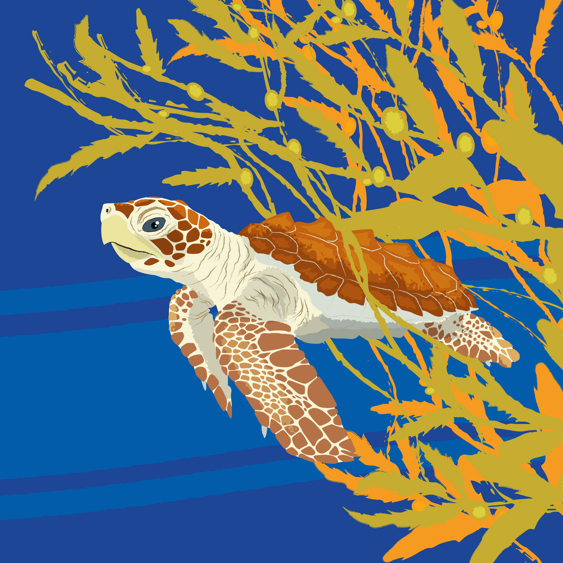
These posters were inspired by 1960s travel ads—particularly the iconic work of illustrator Stan Galli—with bold compositions, saturated color palettes, and vintage typography that capture a sense of adventure and nostalgia.

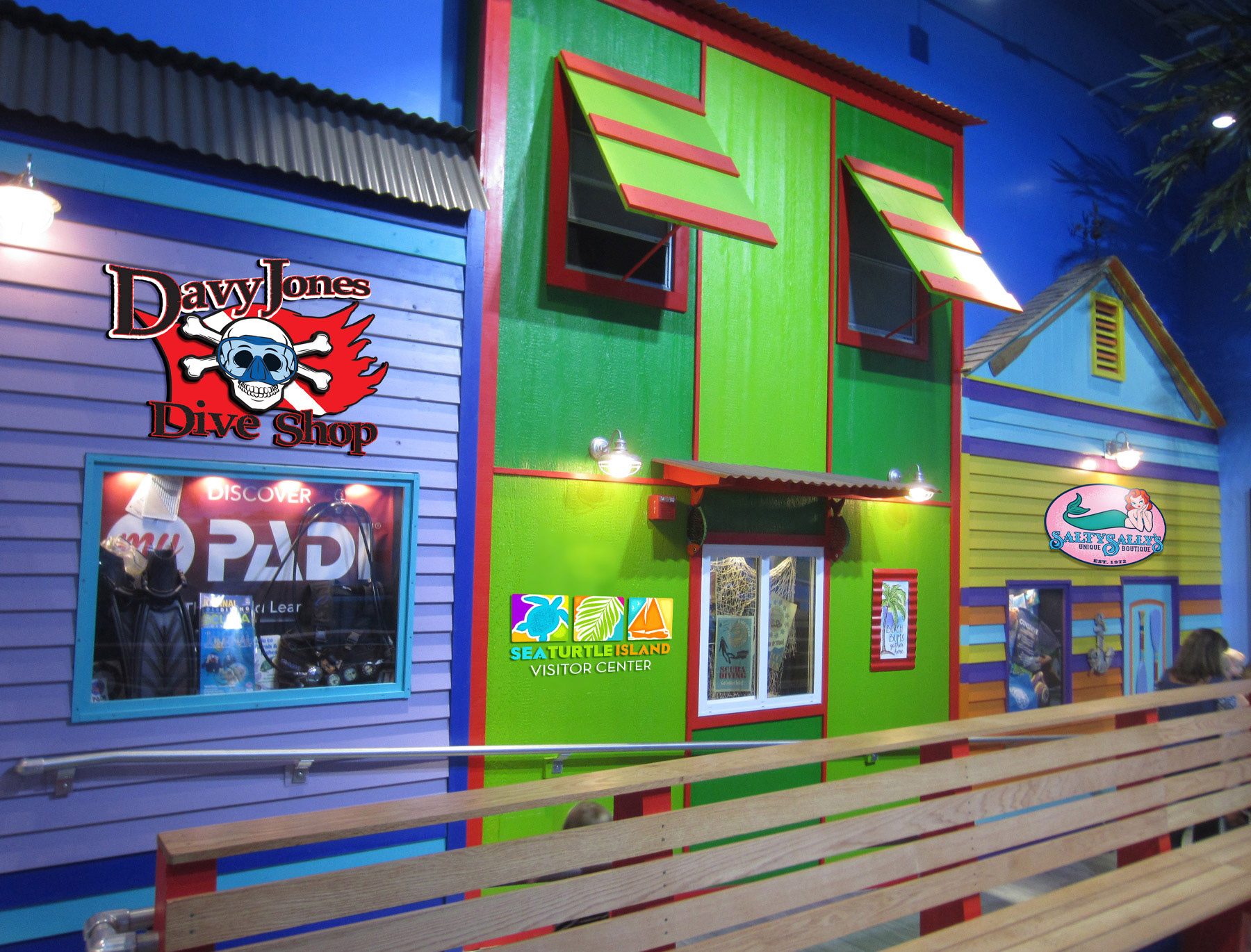
The exhibit includes playful storefronts modeled after a Caribbean boardwalk. I designed custom shop logos to enhance the immersive setting—each one echoing the charm of a seaside town. Shown here are several logo variations created for the exhibit’s facades.